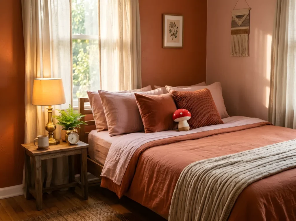
You painted an accent wall three years ago and never touched it again. Not because it’s perfect. Because picking the next color feels riskier than picking the first one. One wrong choice and the whole room reads cheap instead of curated.
The truth is most rooms don’t fail because of a bad color. They fail because of a bad pairing. The right bedroom color combination does the heavy lifting your furniture never could, turning a flat, forgettable box into a space people actually want to wake up in.
1. Sage Green Walls With Butter Yellow Accents
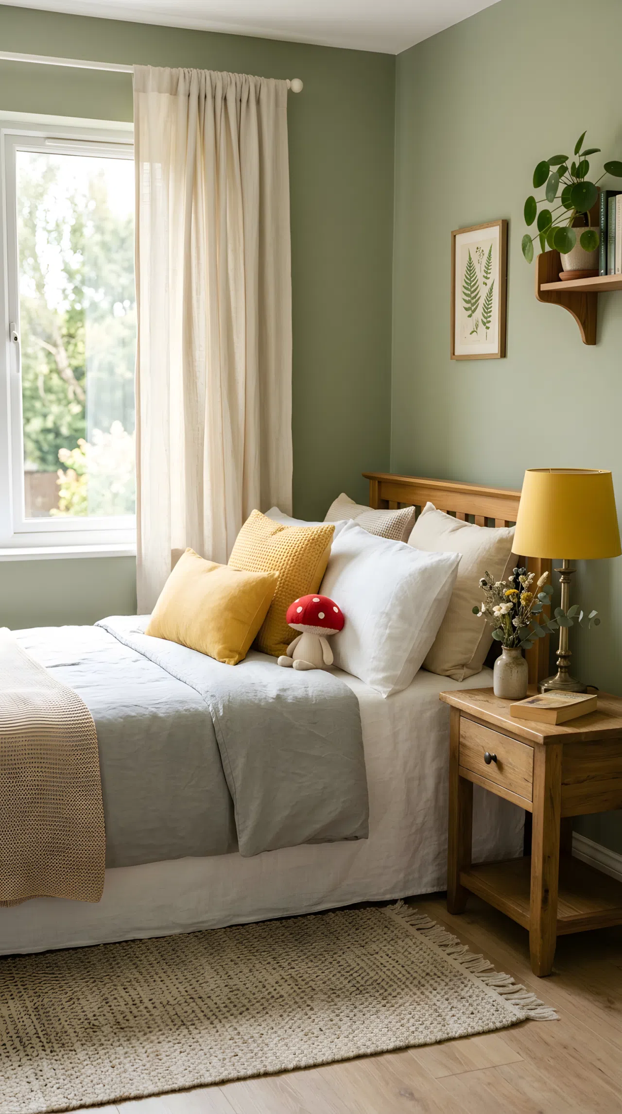
Sage green sets a grounded, garden-like base, while butter yellow accents keep the room from feeling too muted or cold. This bedroom color combination works especially well for anyone craving a space that feels calm in the morning and cheerful by afternoon.
Add the yellow in small doses first, a throw pillow, a lamp shade, before committing to bigger pieces. It photographs beautifully and reads as intentional rather than accidental.
2. A Bold Coral Ceiling Above Neutral Walls
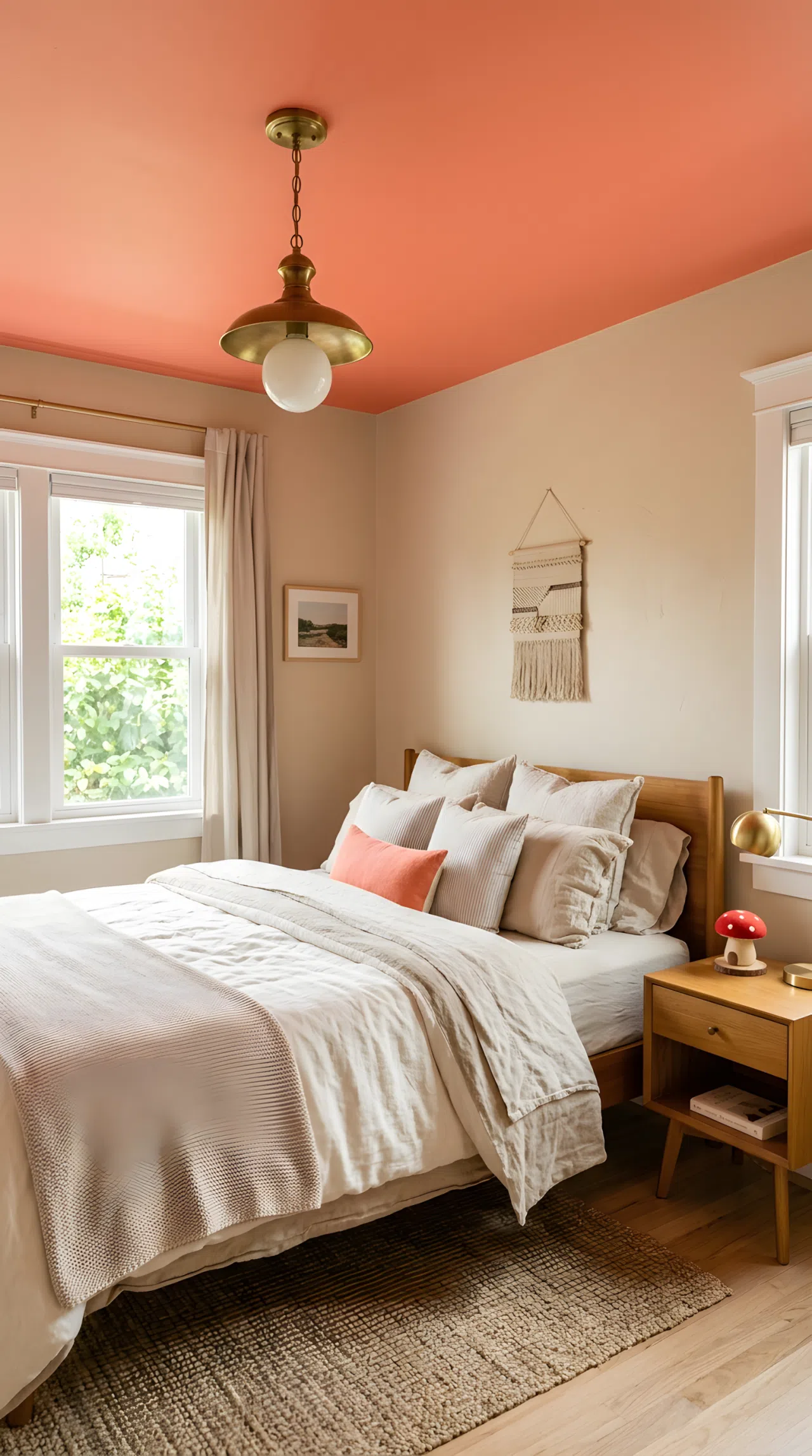
Most people paint four walls and forget the fifth surface entirely. A coral ceiling paired with warm neutral walls flips that habit, creating a cocoon-like feeling the moment you lie down. It’s an easy way to add color without overwhelming a small footprint.
Keep the walls in a soft oatmeal or cream so the ceiling stays the star. This combination feels playful but still grown up.
3. Monochrome Blush Tones for a Softer Feminine Palette
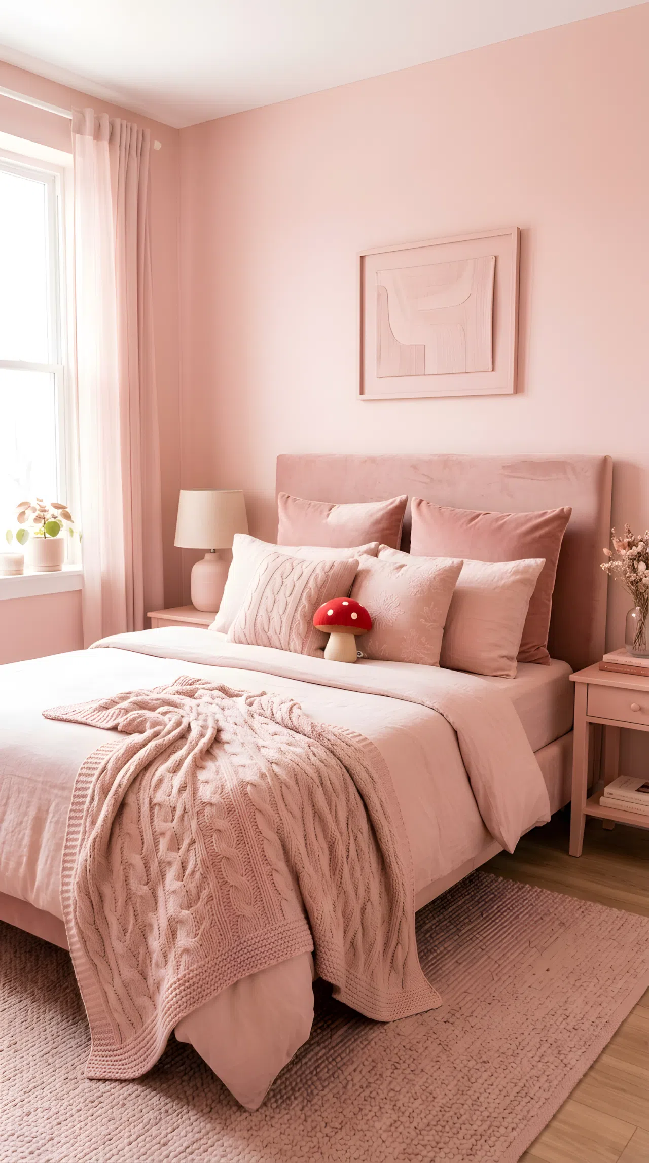
Instead of mixing several colors, a monochrome blush bedroom color combination leans on texture to create depth: velvet, boucle, linen, all in variations of the same soft pink. It’s a forgiving palette for renters who can’t repaint but still want a distinct mood.
Layer textured pillows and a knit throw so the room never feels flat despite the single color family.
4. Charcoal and White Two-Tone Walls for Small Rooms
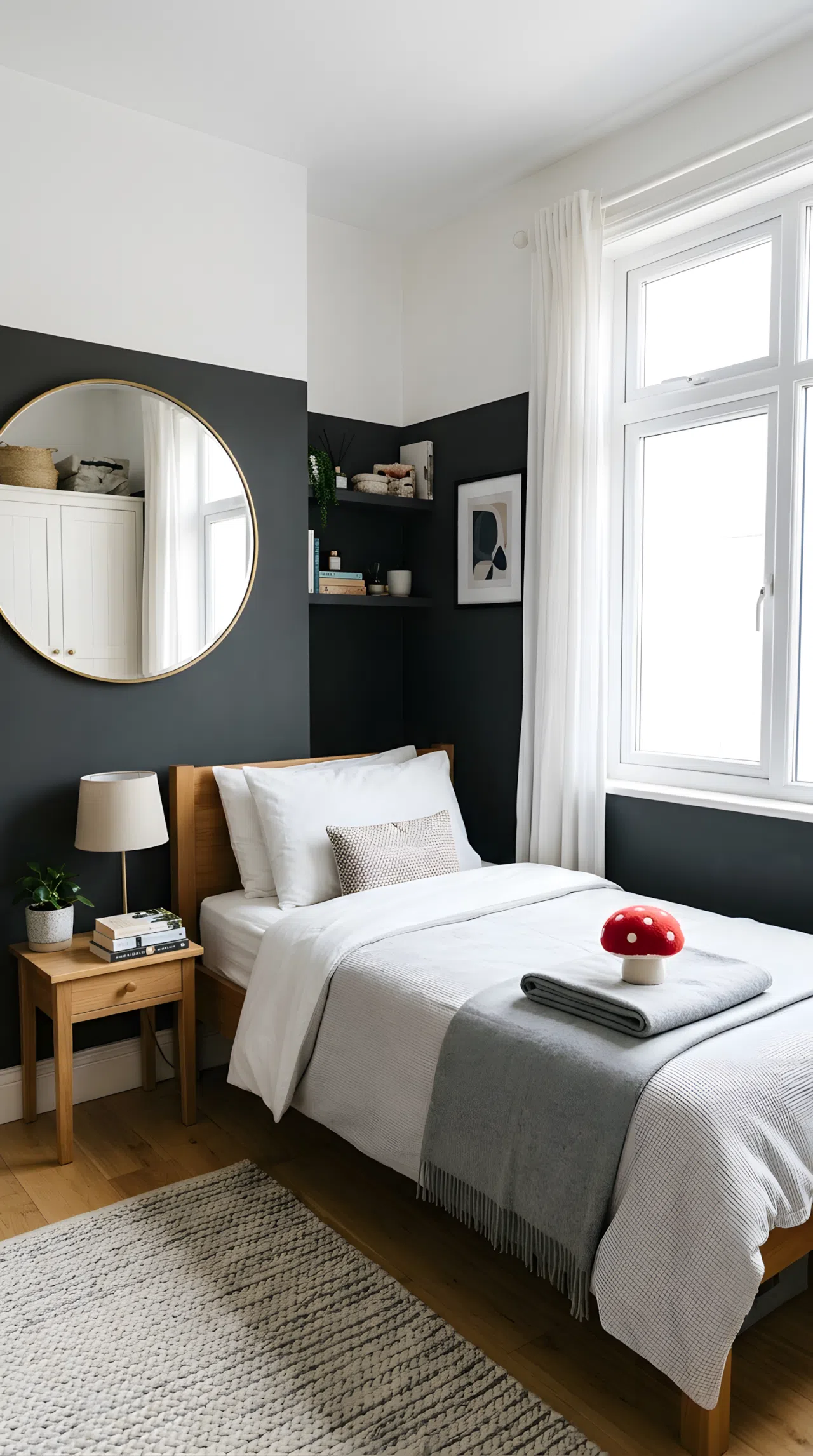
Small bedrooms don’t need to stay all white to feel bigger. Splitting the wall with charcoal below and white above at chair-rail height keeps the ceiling feeling tall while grounding the space. Positioning matters here more than the paint itself.
Place a mirror opposite the window so light bounces across both tones, keeping the darker half from swallowing the room.
5. Dusty Pink and Terracotta for a Warm Sunset Feel
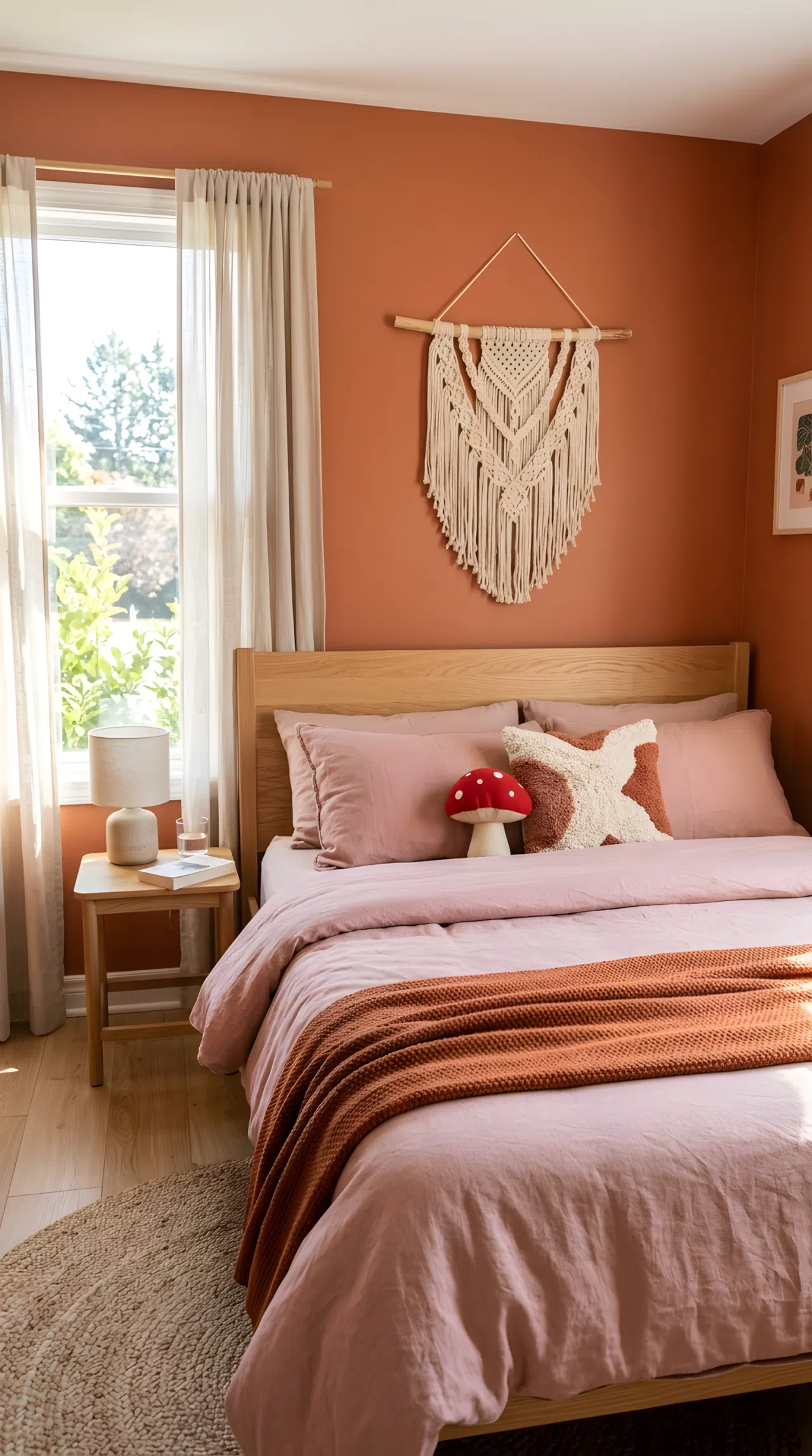
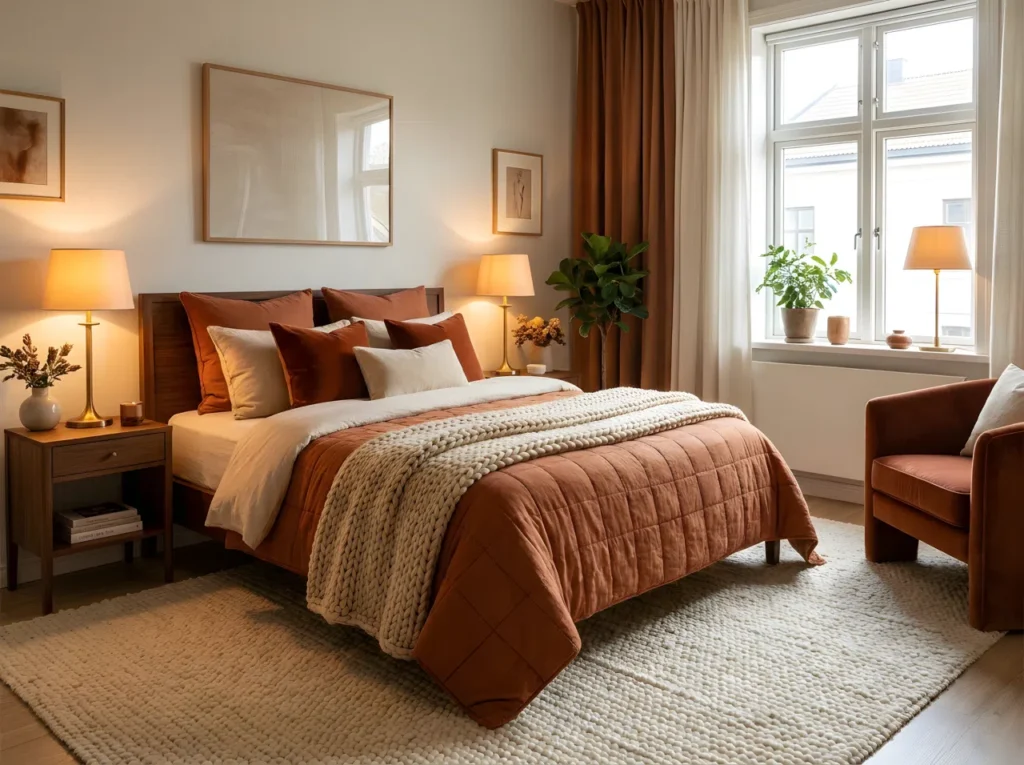
Dusty pink and terracotta borrow their warmth straight from golden hour, making this bedroom color combination feel sun-soaked even on overcast days. It pairs naturally with wood tones and woven textures for an earthy, grounded finish.
Use terracotta as the wall color and dusty pink in bedding or curtains so neither tone competes for attention.
6. Color Blocking With Cobalt Blue and White
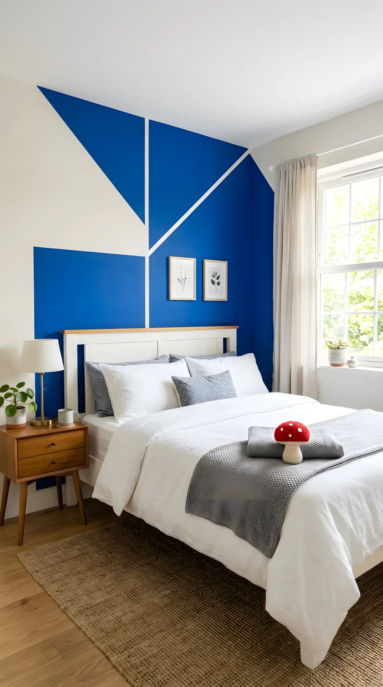
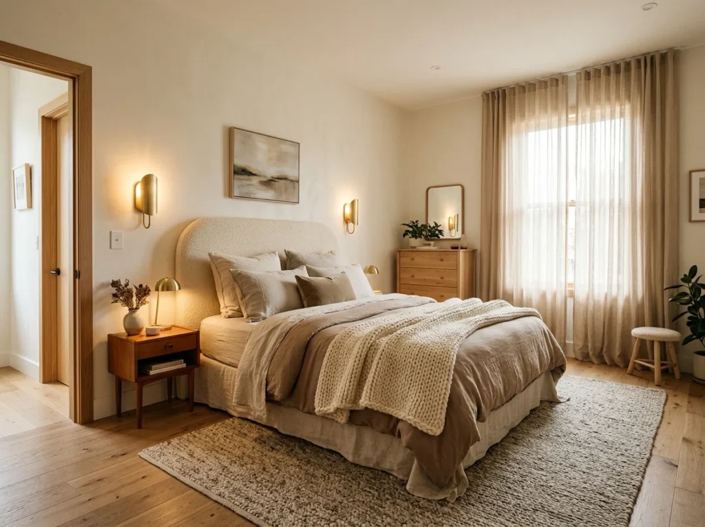
Color blocking turns a plain wall into a designer feature using nothing more than tape and a steady hand. Cobalt blue against white creates a crisp, graphic look that works especially well framing the headboard, giving the illusion of a built-in without any carpentry.
Keep the blocked shape geometric and symmetrical behind the bed so the eye reads it as intentional design rather than a leftover painting project.
7. Navy and Cream for a Timeless, Grounded Look
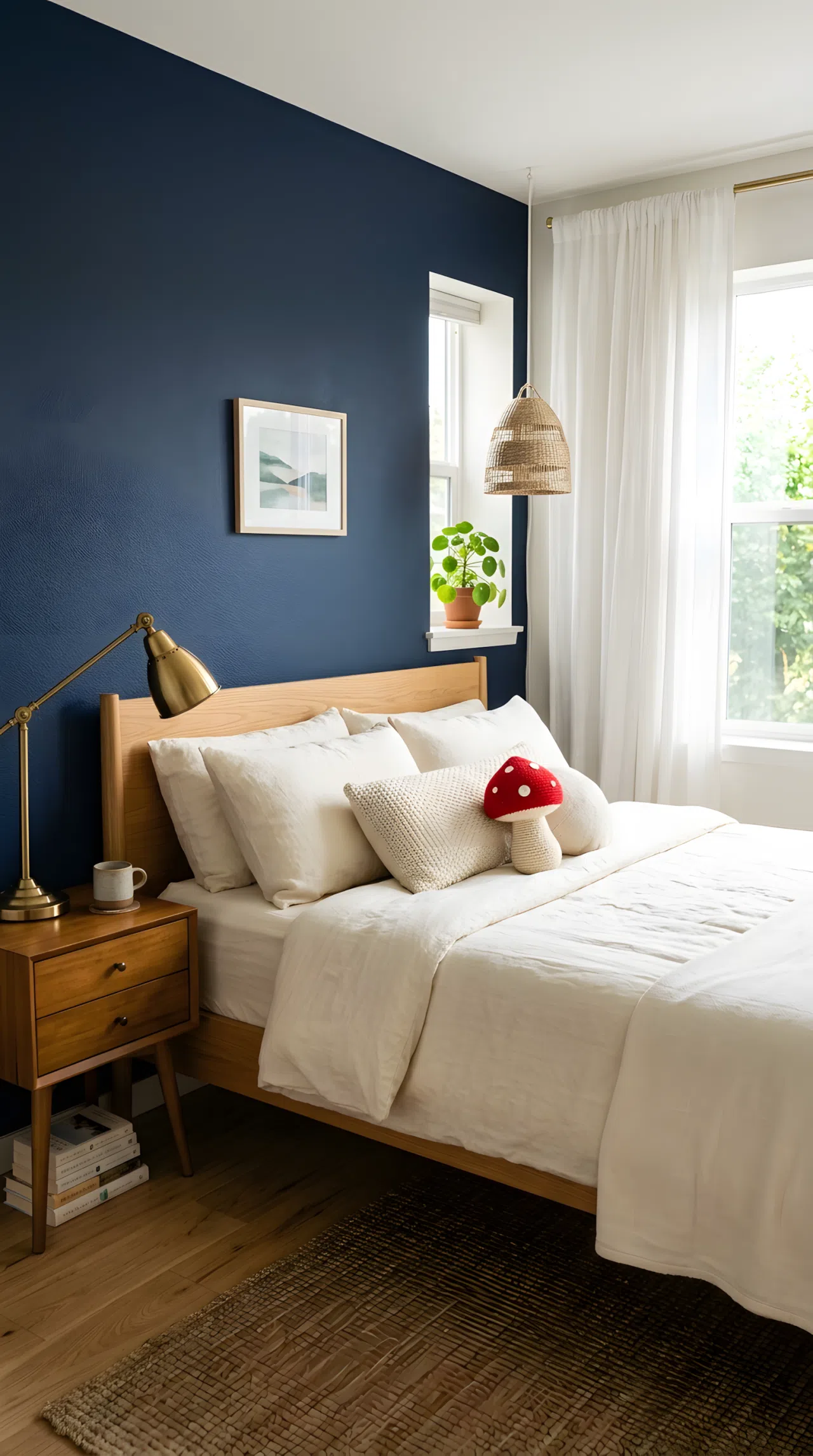
Navy and cream never chase trends, which is exactly why this bedroom color combination keeps resurfacing every few years. The deep navy grounds the room while cream keeps it from feeling heavy, striking a balance between cozy and refined.
Use navy on a single accent wall or in drapery, then let cream dominate the bedding and rug for contrast without visual clutter.
8. Ombré Blues for a Custom, Gradient Statement Wall
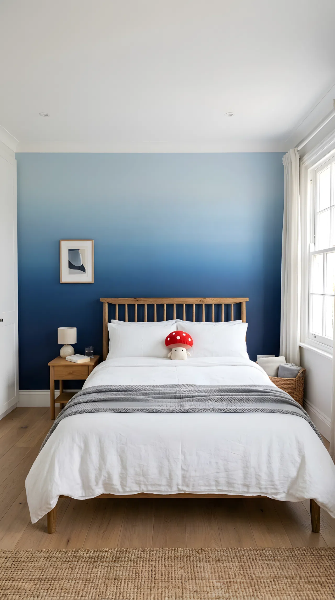
An ombré wall transitions from deep navy at the floor to a soft powder blue near the ceiling, using at least three shades so the blend looks seamless rather than patchy. It’s a technique that photographs exceptionally well and instantly reads as custom.
Budget extra time for wet blending between shades, since rushing the transition is what makes ombré look like poor painting instead of a deliberate gradient.
9. Earthy Boho Tones With Ochre and Raw Umber

Ochre and raw umber connect a bedroom to nature without leaning fully into a themed boho look. This bedroom color combination pairs naturally with jute rugs and linen bedding, creating a wellness-retreat feeling that still functions as an everyday space.
This palette performs best in rooms with west-facing windows, where golden hour light deepens the ochre tones instead of washing them out.
10. Neon Pink LED Accents Against Soft White Walls
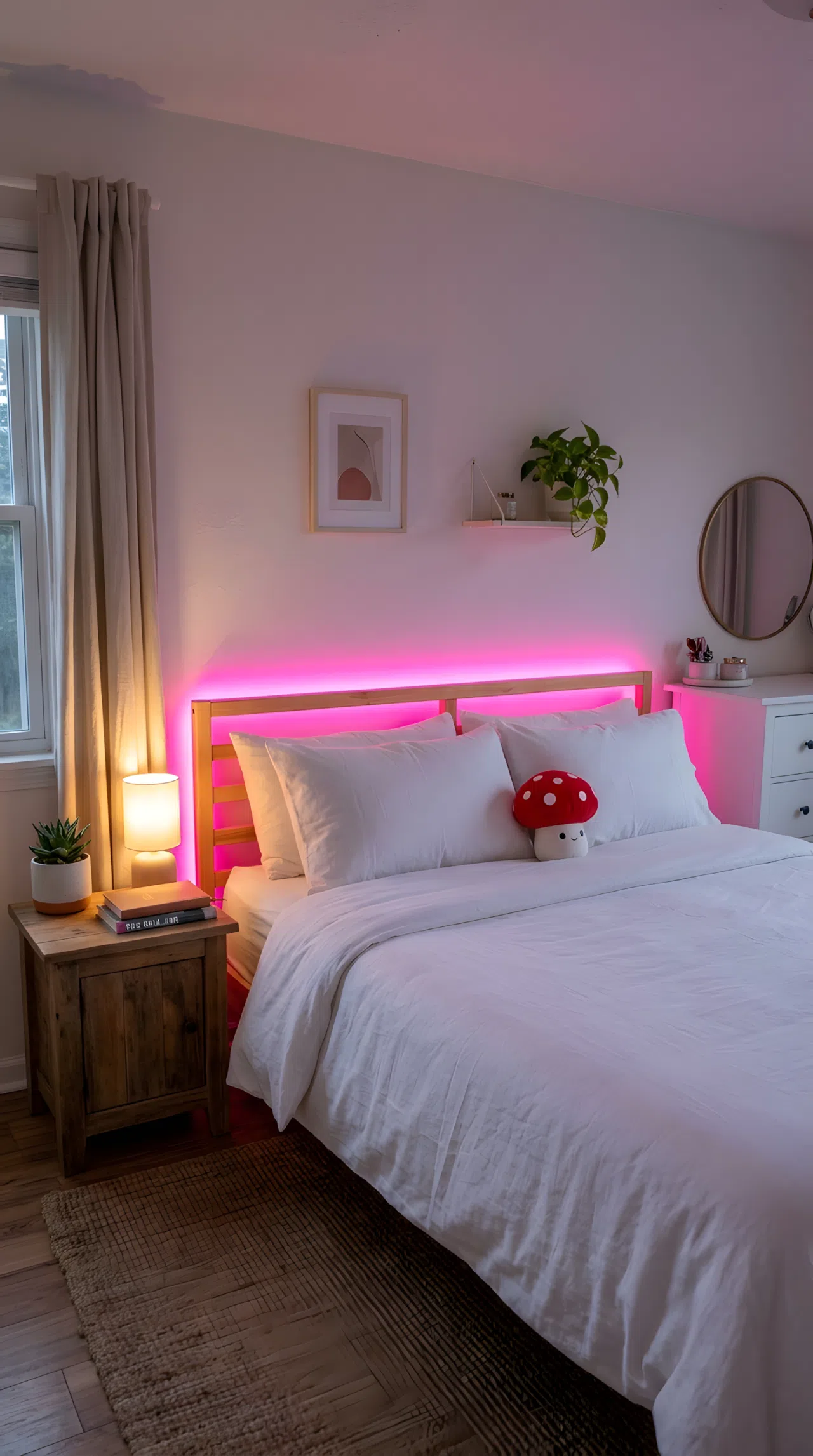
Not every bold statement requires paint. A strip of neon pink LED lighting behind the headboard against soft white walls delivers Y2K-inspired personality without committing to a permanent color choice. It’s especially popular for renters who can’t repaint but still want drama.
Keep the rest of the room neutral so the neon reads as a deliberate accent rather than clutter competing for attention.
11. Grey and Green for a Soothing Modern Palette
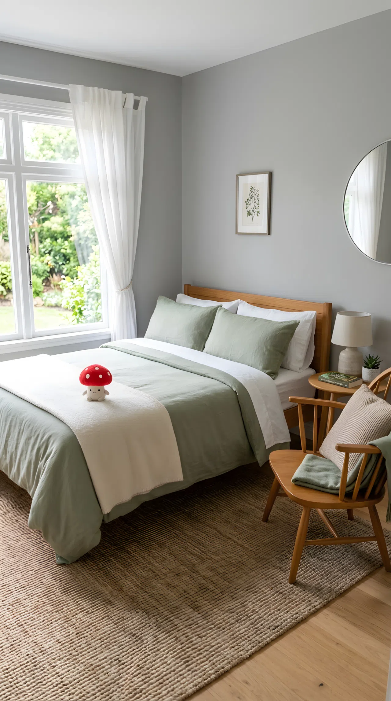
Grey and green share enough coolness to feel unified but enough contrast to avoid looking flat. This bedroom color combination has been trending heavily because it reads as sophisticated without trying too hard, working equally well in modern lofts and traditional homes.
Use grey as the dominant wall tone and let green enter through bedding, a headboard, or a single accent chair so the palette stays balanced rather than competing.
12. A Small Bedroom Palette Built to Look Larger
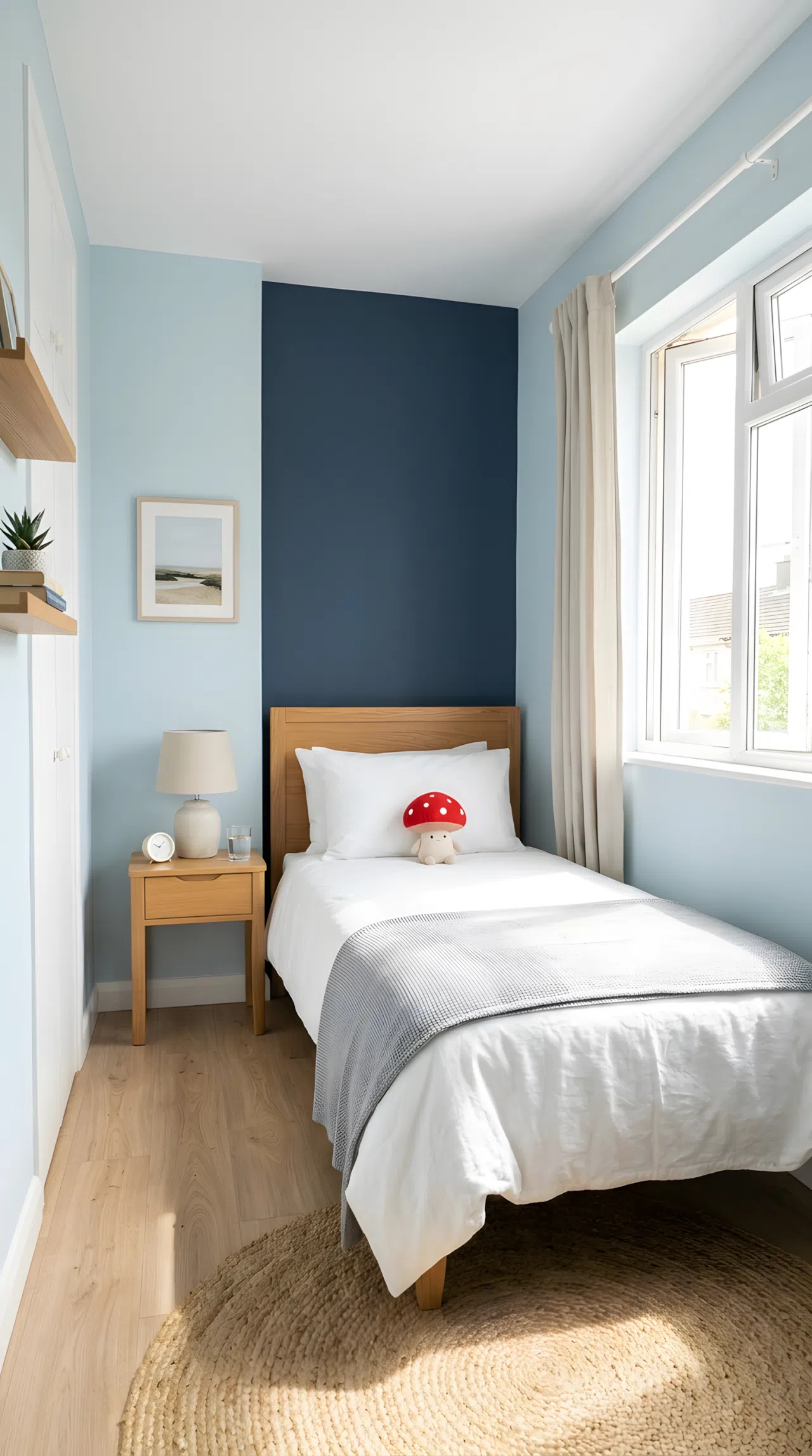
In a compact room, color choice can either shrink the space further or trick the eye into seeing more square footage. Soft, light-reflective tones on walls and ceiling push boundaries outward, while a single darker accent, like a headboard wall, adds depth instead of clutter.
Keep furniture in tones close to the wall color so nothing visually interrupts the room’s flow toward the window.
13. Deep Burgundy for a Comforting, Enveloping Mood
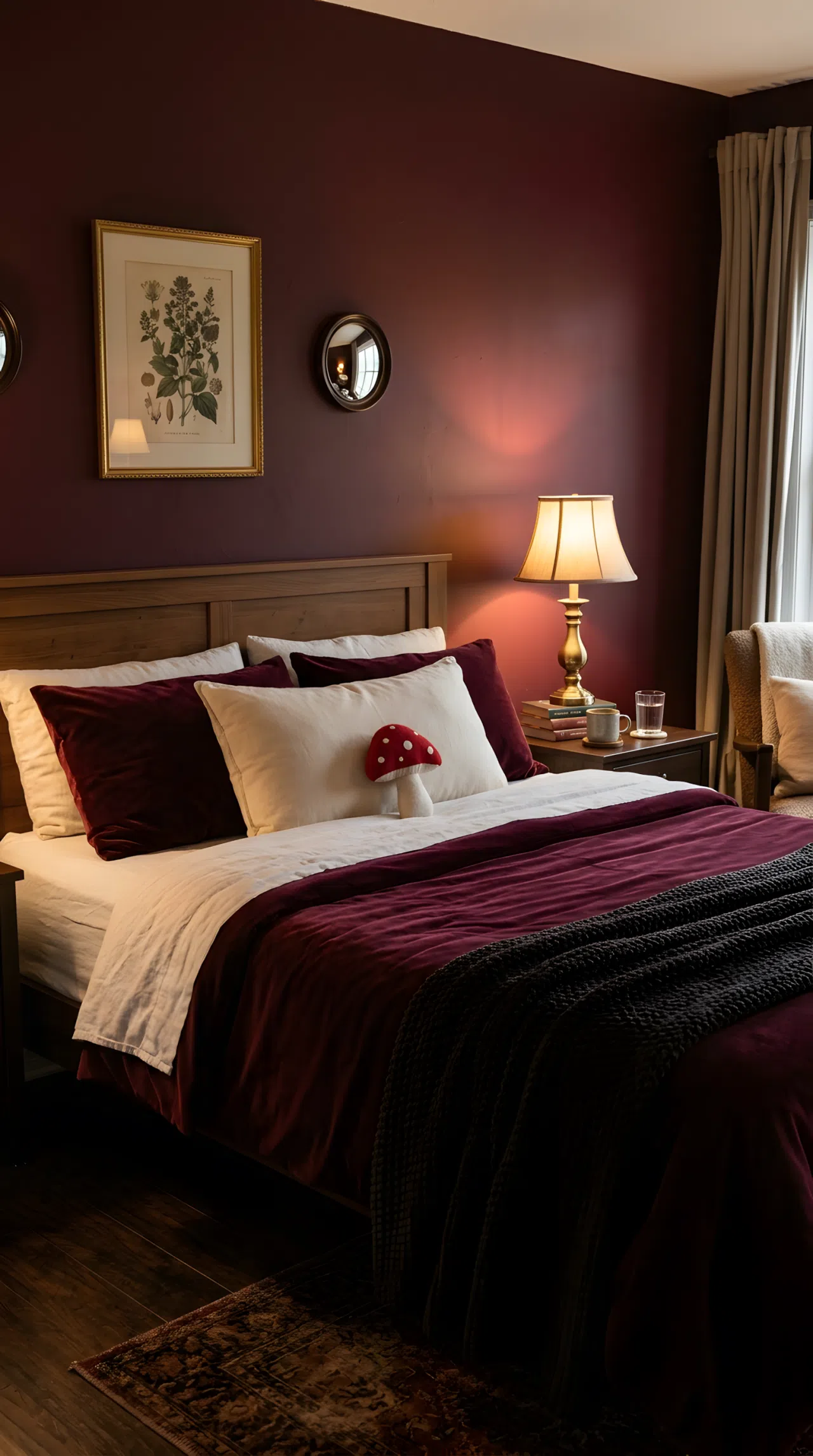
Dark doesn’t have to mean heavy. Deep burgundy walls paired with warm brass or gold hardware create a comforting, almost cocooning bedroom color combination that feels luxurious rather than gloomy, especially when balanced with soft ambient lighting.
Position a warm-toned lamp near the bed rather than relying on a single overhead fixture, since layered lighting is what keeps a dark palette from feeling flat.
14. Vibrant Jewel Tone Accents on a Neutral Base
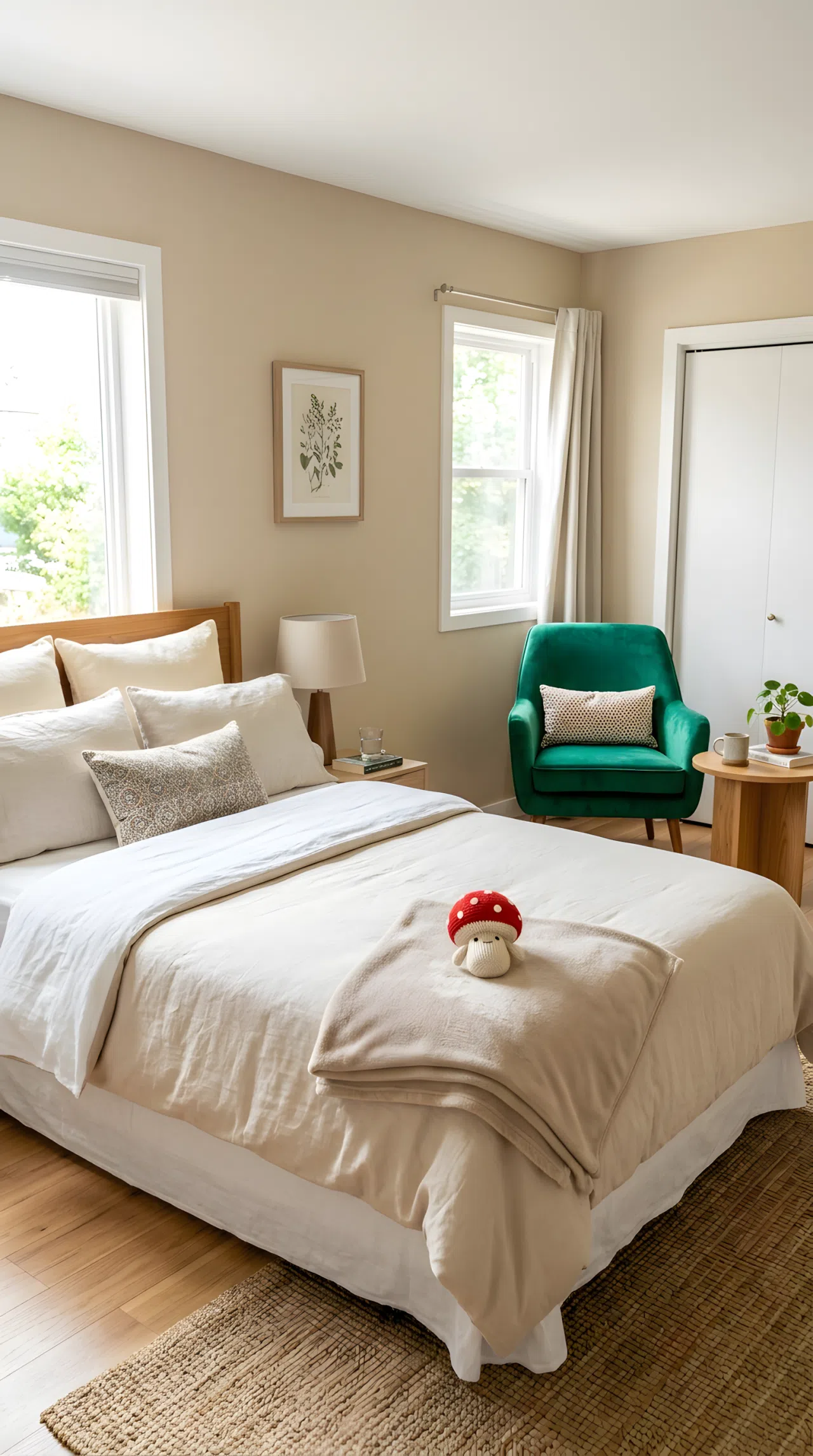
Jewel tones like emerald and amethyst deliver richness without demanding a full room repaint. Dropped onto a neutral base through bedding, curtains, or a single accent chair, they let the vibrant color take center stage while the rest of the room stays calm and functional.
Choose one jewel tone at a time rather than mixing several, so the accent color reads as a confident choice instead of a cluttered one.
15. DIY Headboard Accent Using Color Blocking Tape
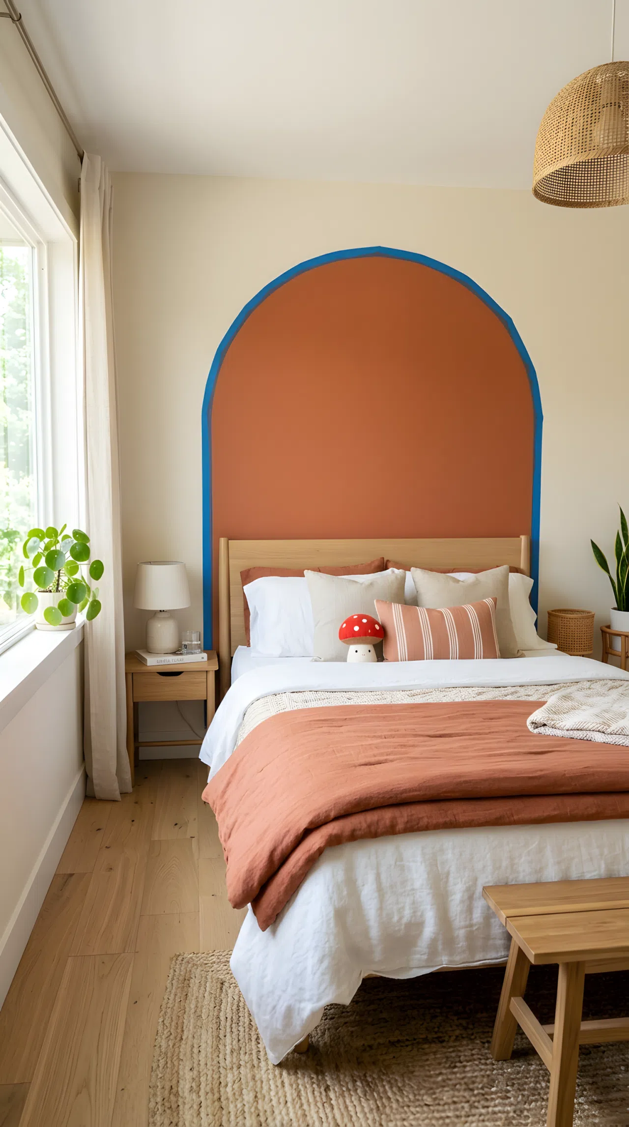
A painted arch or rectangle behind the bed mimics an upholstered headboard for a fraction of the cost. This bedroom color combination idea uses two contrasting tones, one for the arch and one for the wall, to frame the bed like a built-in feature.
Center the shape precisely behind the pillows using a level and painter’s tape, since even a slightly off-center arch undermines the polished look.
16. Serene Turquoise Paired With Soft Ivory
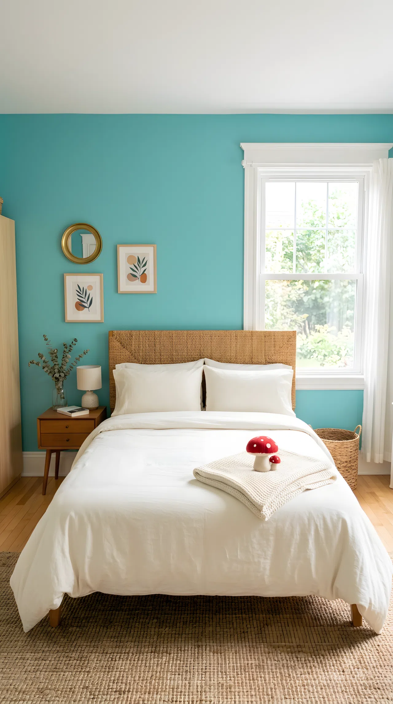
Turquoise carries an instant sense of calm, but full walls of it can feel cold without the right partner. Softening it with ivory trim and bedding keeps the palette serene rather than sterile, striking the balance between refreshing and restful.
Save the turquoise for a single wall or bedding set, letting ivory carry the rest of the room so the color reads as calming rather than overwhelming.
17. Elegant Dark Tones for a Luxury Hotel Feel
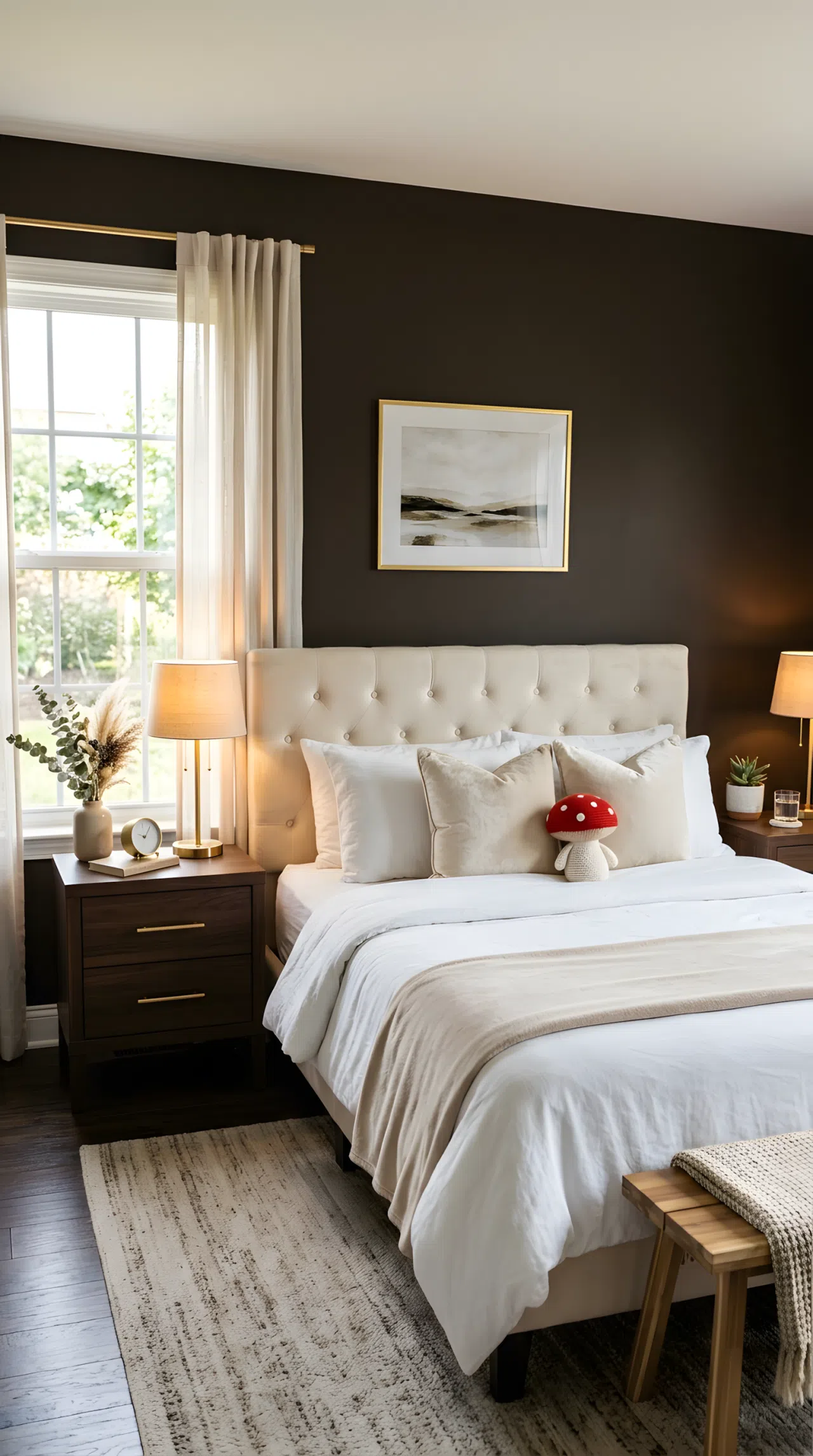
Deep espresso walls paired with gold and cream accents borrow straight from boutique hotel design, giving an ordinary bedroom an unmistakably elevated feel. This bedroom color combination relies on contrast and metallic detailing rather than pattern to create richness.
Add texture through a velvet bench or tufted headboard so the dark tone doesn’t flatten the room under artificial light.
18. Warm Greige for an Effortless Minimalist Base
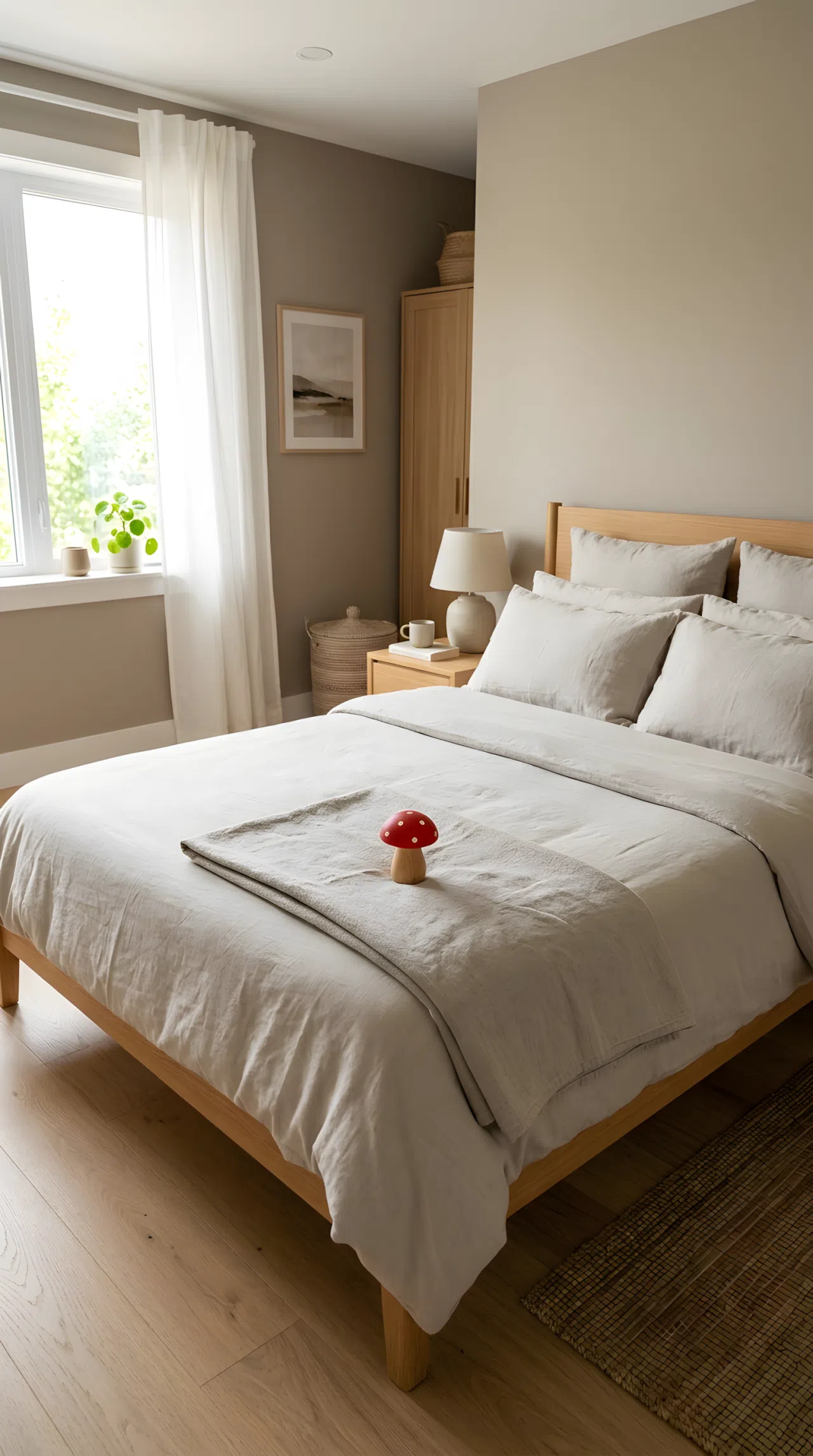
Greige earns its popularity by refusing to commit fully to either warm or cool, making it the easiest bedroom color combination base to build around. It pairs with almost any accent color later, which makes it a smart long-term choice for anyone who likes to redecorate often.
Keep furniture and textiles in a slightly lighter or darker shade of the same greige family so the room feels cohesive rather than mismatched.
19. Layered Pastel Mix for a Soft, Dreamy Room
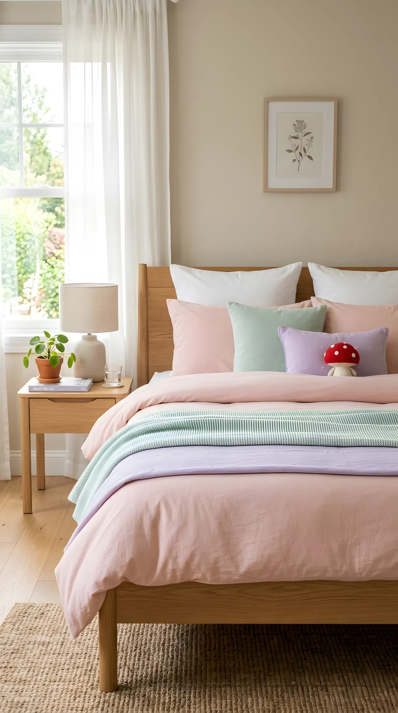
Rather than choosing one pastel, this approach layers blush, mint, and lilac together in small doses across bedding, art, and accessories. The result feels dreamy without tipping into childish, especially when the base wall stays a quiet neutral.
Limit each pastel to one or two objects in the room, since too many competing soft tones can start to blur together instead of standing out.
20. Positioning Warm Lamp Light to Enhance a Rich Color Palette
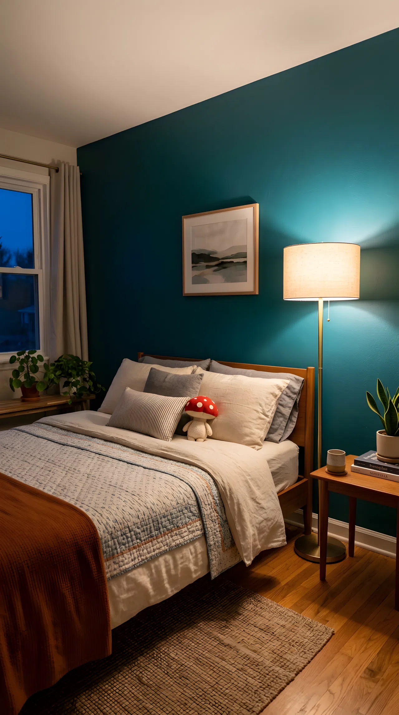
The right bedroom color combination can still fall flat under the wrong lighting position. Placing a warm-toned lamp low and close to a richly colored wall, rather than relying on a single overhead light, deepens the color instead of washing it into a flat, one-note surface.
Angle the lamp so its glow washes upward along the wall, which is what makes a bold color combination feel intentional after sundown rather than dim and neglected.
Twenty ways in, and the pattern is clear: the best bedrooms never rely on one color to do all the work. They pair a grounding tone with something that adds warmth, contrast, or a little unexpected personality, then let lighting and texture finish the job.
Pick one combination from this list that matches how you actually want to feel in the room, not just how it looks in a photo. That’s the real difference between a bedroom that gets pinned and one that gets lived in.